Your cart is currently empty!
Comic Book Elements Explained: Tips for Leveling Up Your Storytelling
Comic books are a unique storytelling medium that combines visual art and written narrative to create immersive and engaging experiences. By understanding and mastering the various elements of a comic book, writers can take their stories to the next level. In this blog post, we’ll explore each element by looking at Frank Miller’s seminal Batman story, The Dark Knight Returns.
Covers
Your comic book’s cover is the first thing potential readers will see. It’s your chance to make a strong first impression and entice readers to pick up your book. A great cover should be eye-catching, memorable, and representative of the story within.
The first issue of the TDKR has one of the most striking comic book covers all time, and for good reason. The bold silhouette of Batman dynamically leaping across a jagged lightning bolt immediately grabs your attention. The contrasting blues of the moody background sky and bright white lightning highlights the dark mystery of the caped crusader. This striking imagery, combined with the simple yet dramatic title design, powerfully conveys the dark, gritty tone of this landmark Batman tale with just a single glance. That’s the impact you want your cover to have to stand out on the shelf and get readers excited to dive into your story.
Some of this comes down to personal taste, but a good exercise is to sit and think about the comic book covers you’ve been drawn to purchase. What was it about those covers that spoke to you? Try to channel those elements into a cover that represents the story you’ve created.

Important:
It’s easy to follow current trend in comics or to ape/homage other artists’ iconic covers, but it’s a disservice to you and your story to phone a cover in or create something just because you think it will sell a lot of copies. It’s about finding balance.
Pages
The page is the largest single unit of comic book. It’s element on which all other elements, including the cover, are set.

This page from TDKR captures many of the other elements of a comic book. It’s a canvas for how those elements are used to express Miller’s story.
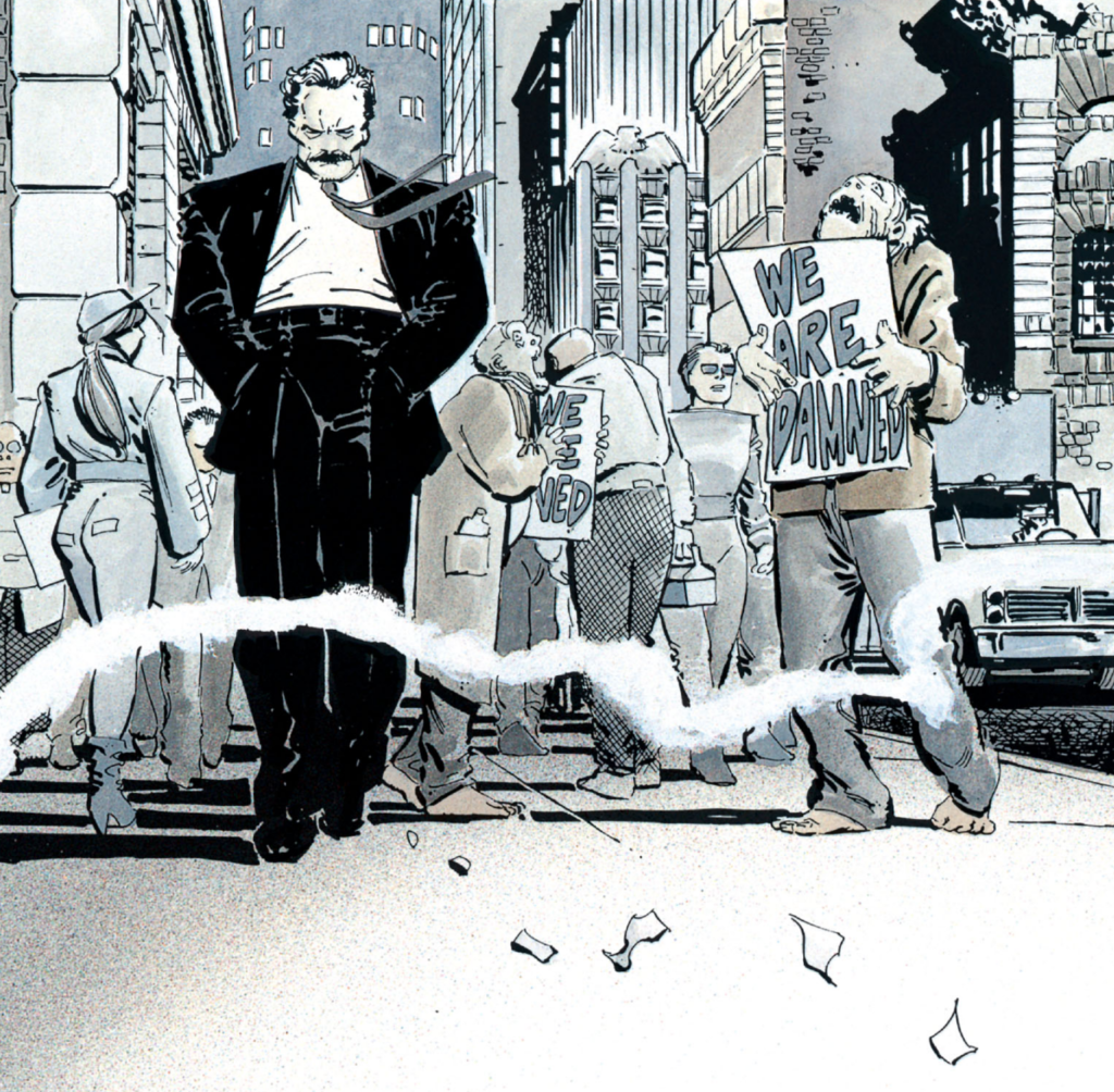
The high-contrast black and white artwork, dramatic angles, and intense close-ups create a moody, psychological tone emphasizing Bruce’s tortured mental state. The dense, layered composition packs a lot of visual information into each page to immerse the reader in the story.
When laying out your own comic pages, consider techniques like these to convey the mood and draw readers into the narrative flow. Think carefully about panel composition, camera angles, visual pacing, and how you guide the reader’s eye across the page. Compelling artwork and thoughtful page design are key to crafting an engaging reading experience that makes your story come alive.
Important:
The page is the basic unit of any comic book and the primary component in which you, as a writer or an artist, should think about how the story is expressed. Everything else, all of the other elements, happen on the page.
Artwork
Illustrations are the visual foundation of your comic book. They bring your story to life and create the world in which your characters live. Collaborating closely with your artist is key to ensuring that the illustrations align with your vision and effectively convey the mood and tone of the story.
Even out-of-context, the artwork from TDKR tells you a lot about the story. The gritty, high-contrast artwork, with its heavy shadows and loose, sketchy linework, creates an intense, unsettling atmosphere reflective of Gotham’s decay and Bruce’s dark psychological state. The low angle framing Bruce heroically even in plainclothes, foreshadowing his impending return as Batman.
Inker Klaus Janson’s bold, stylized shadows and textures enhance the moody, noir-influenced look established by Miller’s raw pencils. This heavily shadowed, expressionistic approach intensifies the dark, psychological tone and the almost apocalyptic sense of a city on the brink of collapse, primed for Batman’s redemptive return.
When developing your own comic’s visual style, look for an artist who can capture the intended mood, atmosphere and personality of your story through their artistic choices. Discuss your vision in detail and provide visual references to align on the look and feel. A cohesive, evocative art style that meshes well with the narrative is crucial to creating an immersive, memorable reading experience, as masterfully exemplified here.
Important:
Whether you are creating the art or you are collaborating with an artist on your comic, the art should match and express your story.
Panels
Panels are the building blocks of your comic book. They break down the story into digestible chunks and guide readers through the narrative. The size, shape, and arrangement of panels can greatly impact the pacing and flow of your story.

The provided image shows a two-page spread from “The Dark Knight Returns” broken down into 9 numbered panels.
Panels 1-4 depict a distraught Bruce Wayne seemingly having a mental breakdown, with a voice compelling him to return as Batman. The tight closeups convey his distressed psychological state.
In panel 5, we see Bruce standing imposingly in a heroic low angle shot. Panels 6-8 then show him springing into action as Batman, with dynamic poses and a defiant inner monologue about his motivations to once again wage war on crime.
Panel 9 is a small inset at the bottom showing a symbolic bat icon.
This sequence expertly uses panel size, layout and progression to pace out Bruce’s psychological transformation and build to his dramatic reveal and return as Batman. The initial narrow panels create a claustrophobic feel reflecting Bruce’s troubled mind. These give way to larger, more open panels as he transforms physically and spiritually, culminating in his powerful leap into heroic action.
When crafting your own comic pages, carefully consider how your panel structure, sizes and transitions guide the reader through the story beats and emotional arc you want to convey. Varying panel dimensions, using dynamic angles, and employing techniques like inset panels for symbolic effect are all great ways to control pacing and impact. A well-designed panel flow keeps readers engaged and heightens pivotal story moments.Copy
Important:
Different effects can be achieved through panel styles. Panel shape and size can be used to emphasize time, distance, and importance. If you’re a writer, be mindful about over-directing your artistic collaborators, but if you’re trying to achieve a specific effect, have a dialogue about it and trust them to execute the best version of that effect.
Panel Layouts
Panel layout dictates the pacing and flow of your story. It determines how the reader’s eye moves across the page and can greatly impact the emotional resonance of a scene. Effective panel layouts can create a sense of tension, anticipation, or release.

The layout begins with a narrow vertical panel, focusing on Bruce’s distressed face as he wrestles internally with the “Batman” persona calling to him. This constricted framing creates a sense of mental claustrophobia and mounting tension.
As Bruce begins to physically transform, pulling on his Batman costume, the panels widen horizontally, conveying a sense of release and expanding action. This shift in panel orientation visually mirrors his psychological transition from the narrow confines of Bruce Wayne to the unbridled power of Batman.
The rightward diagonal flow of the largest panels, showing Batman leaping into action, propels the eye forcefully across the spread. This creates a kinetic sense of momentum and decisiveness as Batman fully emerges.
The inset panel at the bottom acts as a punctuating beat, the singular bat symbol iconically representing Batman’s complete return.
When planning your own panel layouts, consider how the size, shape, and arrangement of panels can mirror and intensify the emotional content of your scenes. Compressed panels can heighten tension or introspection, while expansive panels can convey release, power, or significant story moments. Diagonal orientations can suggest dynamic movement or instability. Inset panels are useful for emphasizing symbolic details or key emotional beats. Employ layout to meaningfully guide readers through your narrative and amplify its emotional impact.
Important:
The most important priority of panel layout is clarity. If you write or drawn the coolest page ever, but if it doesn’t clearly communicate the story, it will only confuse the reader and all your hard work will have been for nothing. If you can lead the readers eye and show them something awesome, you’ve hit the sweet spot for panel layout.
Gutters
Gutters are the spaces between panels. While they may seem like empty space, gutters play a crucial role in comic book storytelling. They allow readers to fill in the gaps with their imagination and create a sense of anticipation between panels.
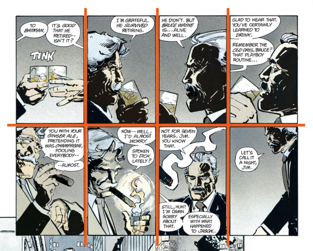
You should pay close attention to the gutters, or spaces between panels, when crafting your comic book pages. While gutters may seem like empty filler, they actually play a crucial role in storytelling by allowing readers to fill in the gaps with their own imagination and creating a sense of anticipation from one panel to the next.
In the scene from TDKR above, the gutters provide brief pauses that control the pacing of Bruce and Jim Gordon’s conversation. The uniform size and placement of the gutters moves us steadily through the dialogue, panel by panel. But the gutters also invite us to imagine what is being left unsaid between the panels – the facial expressions, body language, and subtle tensions hanging in the air during each beat of the scene.
By varying the size and shape of your gutters, you can create different rhythms and emphases throughout your story. A thin, quick succession of gutters might convey a frenetic, action-packed sequence, while larger gutters can slow things down and add weightiness to dramatic moments. Thoughtful gutter use is key to making your comic book flow and allowing art and dialogue to breathe on the page. So when planning your layouts, consider gutters an essential part of the design, not just dead space.
Important:
Like with panels, gutters can be used to communicate storytelling. The key is to experiment and decide what kind of gutters are best for a particular scene, page, or moment.
Splash Page
A splash page is a full-page illustration that sets the tone for your story. It’s an opportunity to make a bold statement and immerse readers in your comic book’s world from the very beginning. Splash pages can be used to introduce key characters, establish the setting, or create a powerful emotional impact.
You can use a splash page like this to make a bold statement and immediately immerse readers in the world of your comic book. A splash page is a full-page illustration that sets the tone and grabs attention from the very start. It’s an opportunity to introduce key characters, establish the setting, or create a powerful emotional impact that will draw readers into your story.
This splash page from TDKR is an iconic example of how to use a splash page for impact. The dramatic shot of Batman diving into the noir-soaked Gotham skyline plunges us into the dark, gritty universe of Miller’s tale and re-establishes Batman as an imposing, capable figure. We immediately get a sense of the larger-than-life tone and neo-noir style that defines the series.
When crafting your own splash page, look for a striking, atmospheric image that will set the stage and leave readers eager to dive into your story. Use the oversized canvas to create an immersive, visually impressive experience that conveys are key story beat or character moment that you want your reader to hang on to just a little bit longer.
Important:
Because of their scale, splash pages cause the reader to stop and focus. That’s a powerful storytelling tool and should be reserved for important moments and story beats or extremely awesome, show-stopping artwork. Do not waste a splash page on non-important moments just to add a quick page to your script. That is lazy.
Color
Color sets the mood and atmosphere of your comic book. It can evoke emotions, create visual interest, and guide the reader’s eye through the story. Effective color use can greatly enhance the impact of your comic book.

You can set the mood and atmosphere of your comic book through effective use of color. Color choices evoke emotions, create visual interest, and guide the reader’s eye through the story. For example, in The Dark Knight Returns, Frank Miller uses a limited color palette of moody grays and blacks punctuated by pops of bright color to convey the gritty, dark tone of an aging Batman coming out of retirement in a Gotham that has descended into chaos and violence.
The muted colors reflect Batman’s own weariness and disillusionment, while the bright colors, often reds, symbolize the violence and madness he must confront. Miller’s masterful use of color is a key element in making The Dark Knight Returns an impactful and unforgettable story. As you craft your own comic, consider how you can employ color to powerfully shape the overall mood and complement your story’s themes and narrative arc.
Important:
Color is an often-overlooked aspect of comic book storytelling, but it is what brings the artist’s line work to life. Ask yourself how color can be used to emphasize the mood of a scene or to elevate the story. Good color will keep the reader in the story. Great color will enhance the reader’s experience.
Lettering
Lettering is the art of placing text within the panels, including dialogue, captions, and sound effects. The style and placement of the lettering can greatly impact the readability and overall aesthetic of your comic book.

You should pay close attention to lettering as you create your comic book, as the style and placement of text within the panels can greatly impact readability and overall aesthetic. Dialogue, captions, and sound effects serve both functional and artistic purposes. For example, in The Dark Knight Returns, the lettering mirrors the gritty, frenetic tone of the story and artwork. Dialogue is hand-lettered in a scratchy, uneven style that feels as psychologically and physically weathered as the characters themselves. Sound effects are rendered in an equally harsh and stylized manner, often violently slashing across panels to heighten impact. This lettering works in harmony with the dark, expressive artwork to create a visceral, immersive reading experience. As you letter your own comic, experiment with ways to use text as a graphic element that enhances the mood and integrates seamlessly with the visuals on the page.
Important:
Comics are expensive to make and there’s no getting around that. Sometimes, to save some money, writers will cut corners with lettering. Absolutely do not cheap-out on lettering, though. One of the easier ways to turn a reader off to your book is with bad lettering.
Speech Bubbles
Speech bubbles contain your characters’ dialogue and are essential for bringing your characters to life. The shape, size, and placement of speech bubbles can convey emotion, tone, and the dynamics between characters.
Important:
Letter’s who are just starting out and who haven’t built-up their letting toolkit may opt for perfectly round bubbles/balloons. These kinds of bubble stand out to readers, in a bad way. Look at any professional comic book. No two bubbles are quite the same. Variety of bubble shape makes the lettering feel more organic and keeps the reader’s attention on the story.
Dialogue
Dialogue is the heart of your characters’ interactions and a key tool for advancing the plot and revealing character motivations. Great dialogue should feel natural, purposeful, and true to each character’s unique voice.

Important:
This is age-old wisdon from novels and screenplays, but you should always read your dialogue out loud. People write and speak in very different ways, so when you write comics dialogue, you need to hear whether it sounds natural or not. Your reader will know when something sounds written.
Captions
Captions provide context, narration, and insight into characters’ thoughts. They can help bridge gaps between panels, provide exposition, or offer a different perspective on the story.

Important:
Your captions/narration should always give the reader something they can’t see on the page. If your reader can already see what you’re writing in your captions, they’re redundant and should be cut. Instead, give the reader a window into what the character is thinking. Captions can be just about anything thematically related, but should never be redundant.
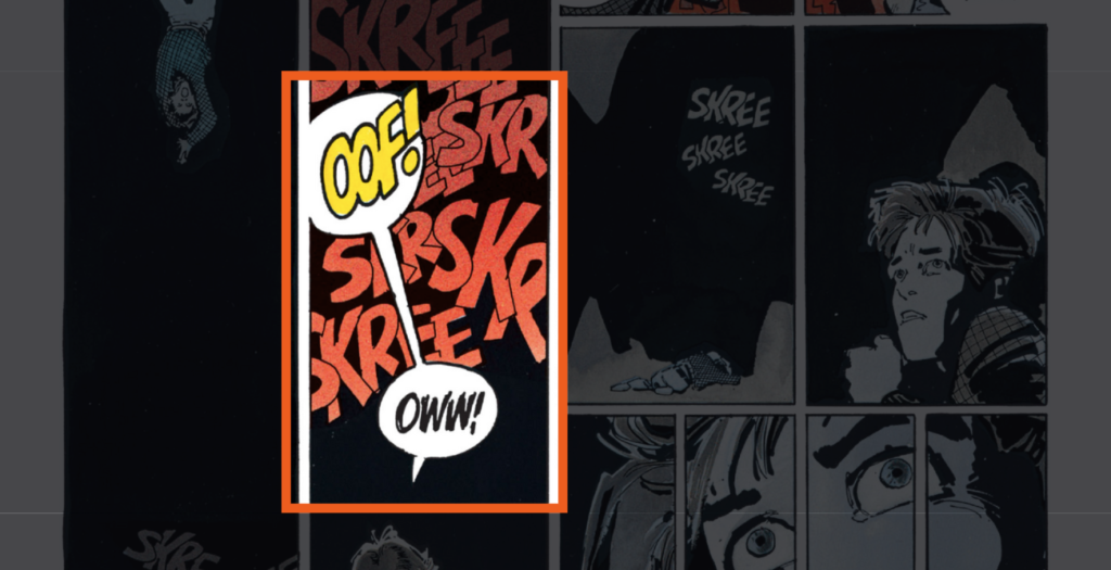
Sound Effects
Sound effects add an auditory dimension to your comic book. They help bring the action to life and create a more immersive experience for the reader. Sound effects can range from subtle background noises to bold, exaggerated exclamations.

Important:
Sound effects (SFX) can be powerful for elevating story and art, but they can very easily detract. Like all lettering, you want SFX that look professional and organic.The best SFX blend seemlessly into the art, enhancing it.
Cliffhangers
Cliffhangers are a powerful tool for keeping readers engaged and eager for the next installment of your story. They create a sense of anticipation and excitement, leaving readers on the edge of their seats and desperate to know what happens next.
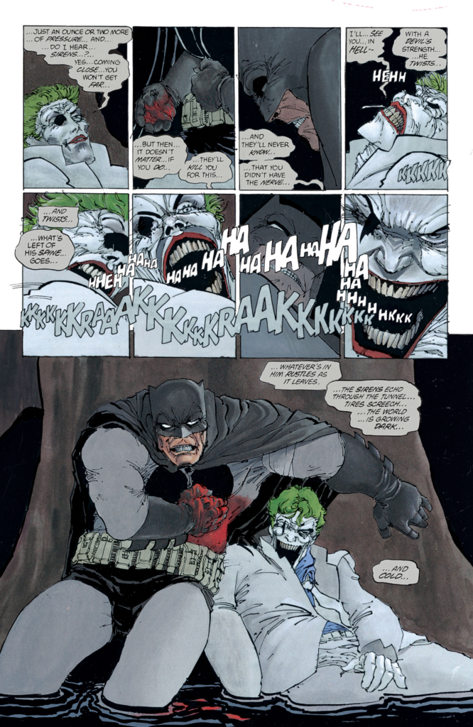
For example, this sequence cuts away right when Batman and Joker’s confrontation reaches a literal chokehold, leaving us to wonder if Batman will cross the line and take the Joker’s life once and for all. By strategically using cliffhangers at key points, you can structure your story to be a gripping page-turner that readers won’t be able to put down. Look for opportunities to end scenes with shocking reveals, perilous situations, or unanswered questions that will keep your audience coming back for more.
You can use cliffhangers like this as a powerful tool to keep readers engaged and eager for the next installment of your comic book story. By ending a scene or issue on a moment of high tension or uncertainty, you create anticipation and excitement that will leave readers on the edge of their seats, desperate to find out what happens next. The Dark Knight Returns masterfully employs cliffhangers throughout to continually raise the stakes and pull readers deeper into the story.
Important:
Cliffhangers should entice your reader to return, but you should avoid bait-and-switch or gimmicky cliffhangers. Think of a cliffhanger as a promise, rather than trick, and make good on that promise in the next issue.
Learn Smarter, Not Harder
When comes to mastering the craft of comic books, you need to be come a life-long learner. When you’re passionate about something, you never stop learning, and reading blogs like this one, is one way to do that.
Another way is to learn directly from those who’ve already learned the hard lessons. I’ve spent A LOT of time learning and thinking about comics, creativity, and productivity. I’ve done this work, so you don’t have to. And you can access this knowledge each week for FREE by joining the EFFIGIES newsletter.
Read Next
Now that you know the various parts of comic book, the next step on your writer’s journey to put them all to work in a script. For that, you’ll need to choose a comic book script format that works for you. To learn about the different comic book script templates, check out how guide on how to format a comic book script next”
Final Thoughts
By mastering these comic book elements and implementing these tips, you’ll be well on your way to creating captivating and memorable stories that will keep readers coming back for more. Remember, creating a great comic book is a collaborative effort between the writer, artist, letterer, and colorist. By working together and leveraging each element effectively, you can take your storytelling to the next level and create truly unforgettable comic book experiences.
[ez-toc-widget-sticky]
Frank Gogol is a San Francisco-based comic book writer. He is the writer of Dead End Kids (2019), GRIEF (2018), No Heroine (2020), Dead End Kids: The Suburban Job (2021), and Unborn (2021) as well as his work on the Power Rangers franchise.
Gogol’s first book, GRIEF, was nominated for the Ringo Award for Best Anthology in 2019. Gogol and his second book, Dead End Kids, were named Best Writer and Best New Series of 2019, respectively, by the Independent Creator Awards.
